Blinder, UX/UI design project for a dating app
The Blinder project is about a dating app and the problem it tries to solve is that users of dating APPs like Tinder find it difficult to match profiles by affinity.
So, the requirements of the app were:
- To meet people by affinity or common tastes
- The profiles are shown with a blurred picture and the user has to decide «liking» someone without seeing the clear picture.
- Once 2 people like each other there’s a match and they can start chatting.
Research process
I’d started with the research process to understand better the users goals, and once I’d identified the problem I’d needed to define the target. For that I made:
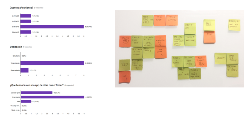
- 2 in-depth interviews
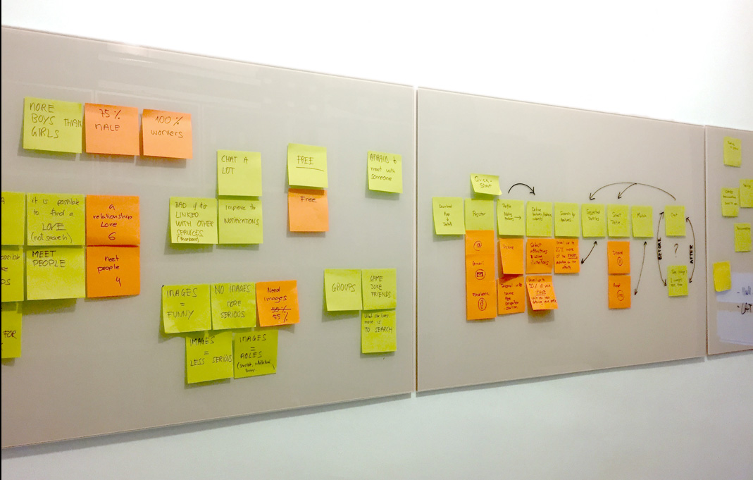
- A Survey to test some of the assumptions I’d took from the Interviews
- An Affinity Diagram to clarify the recollected data
With this information I’d created the user types to clarify the different groups of users
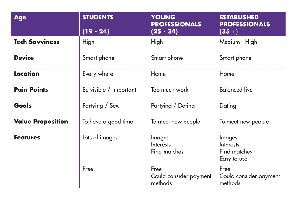
And with them, I’d decided to create only one User Persona because I’d found a clearly defined target.
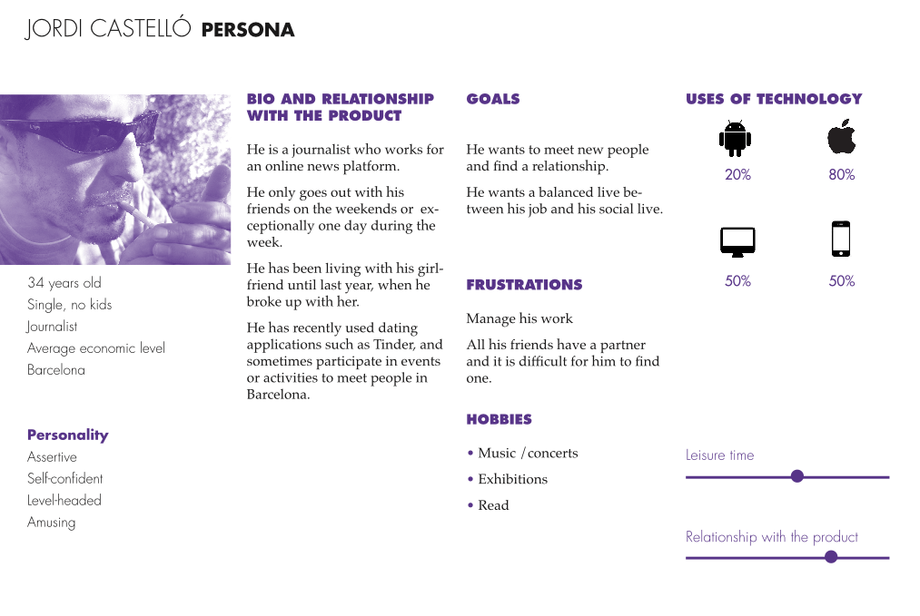
He is a single thirty-four years old man, who wants to meet new people with similar affinities to find a relationship.
This User Persona helped me during all the process to focus the product and understand the users needs.
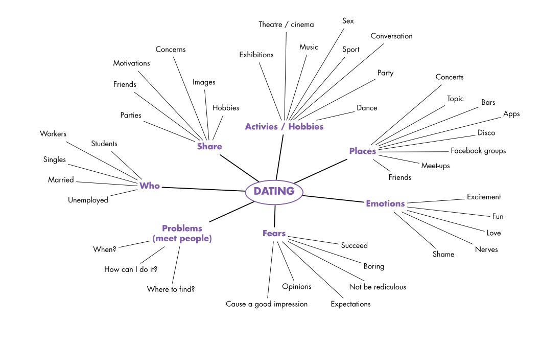
I’d created a Mind Map to start thinking about the main topics and to brainstorm some of the initial ideas.
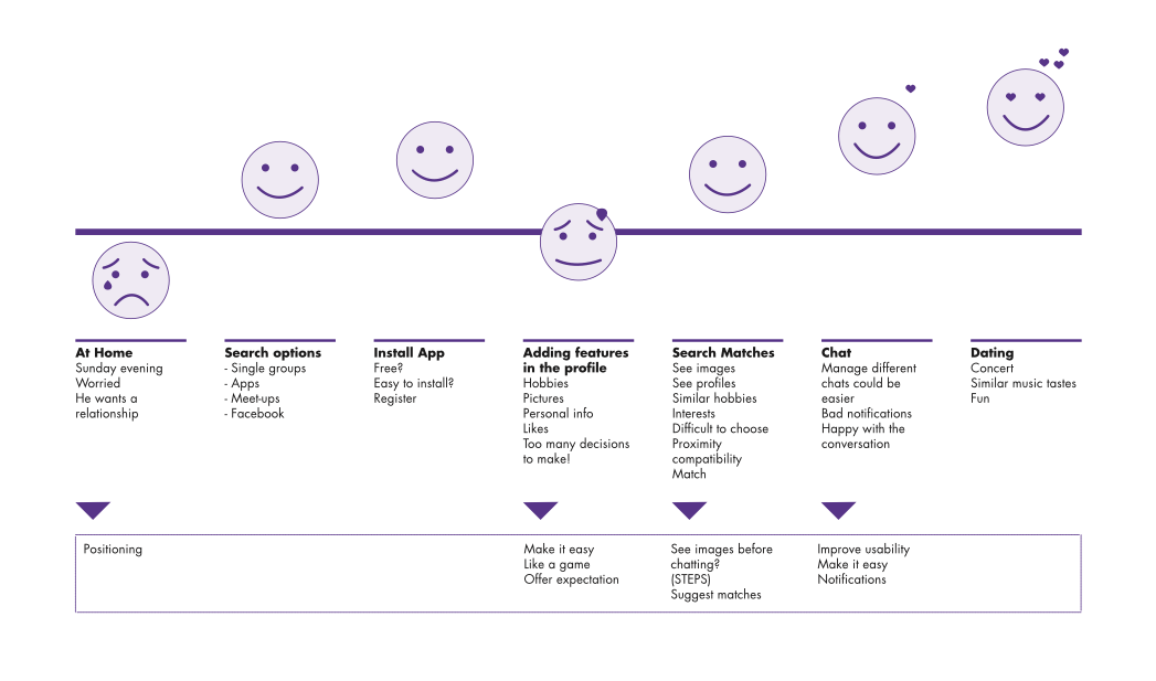
The Customer Journey Map was important to create a visual representation of how the persona will use the app.
This step was specially important on the creative process because thinking on the critical moments helped me to start discovering possible solutions. I realized that I needed a complete profile in order to offer more affinity matches, and I thought that the blurriness of the image could be dependant on the completness of the profile.
Finally I started thinking about the platform, and the first Story flows
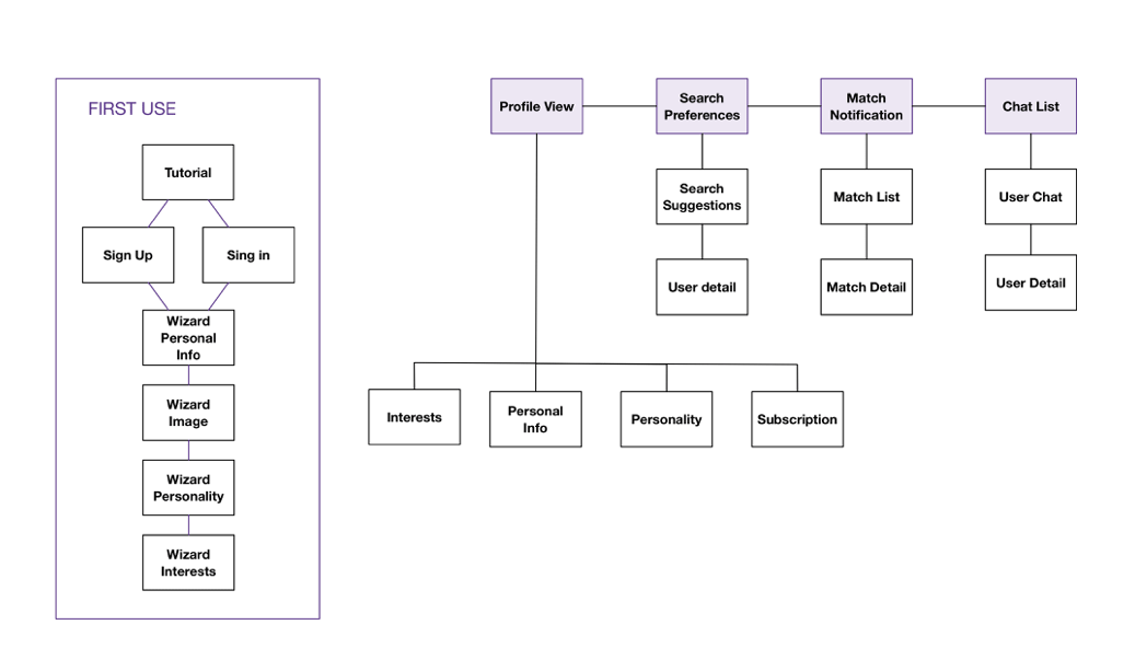
Information Architecture
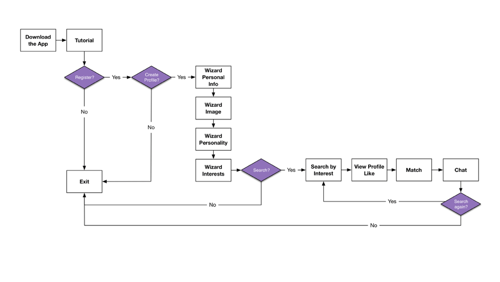
Next, was Information Architecture, where I’d started thinking about the Navigation, the User Flows, the Tasks and the Site Map.
This is the flow chart of the app from my User Persona point of view.
And this is the Site Map, where I had to think how to hierarchizy the content and the screens.
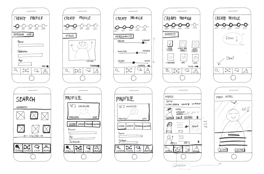
During all this process I’d made lots of hand-made sketches. They where an important part of the design process and helped me to clarify ideas.
At this point. It was time to start thinking about the visual design.
Visual design
First, I’d started with some medium fidelity Wireframes to see how the app could look in general terms.
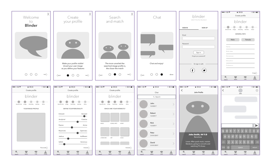
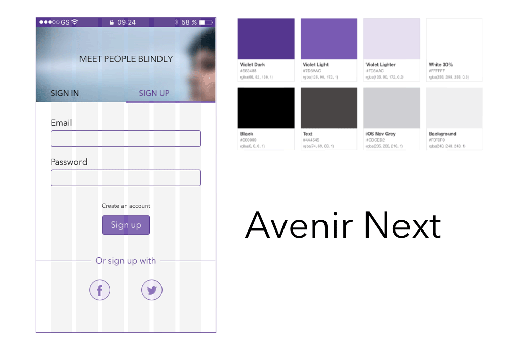
Then I’d defined the design elements to start with the high fidelity mockups
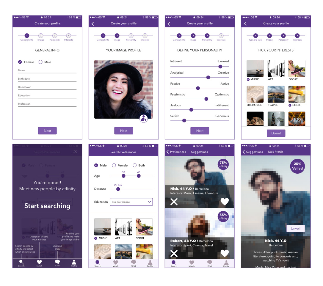
And these are the main pages
And this is the prototype that helps to to make a user test and correct some of details about the navigation.