What's Next, UX/UI design project for a TV shows management app
The main problems this app tries to solve were that:
- There are lots of TV Shows available, and it’s difficult choosing the next one.
- People prefer friends' recommendations because the others are not reliable
- With recommendations coming from everywhere, it’s difficult to remember who recommends you something and why
- The list of pending shows tends to be too long
To solve them, I’d started with a research process to understand better the users needs.
Research process
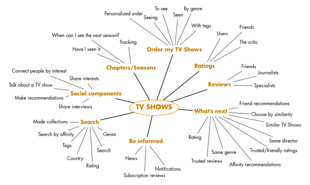
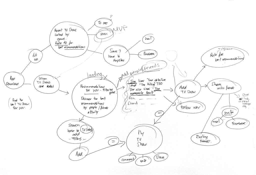
Once I identified the problem I created a Mind Map to start thinking about the main topics and to brainstorm some ideas.
Then, I’d tried to identify the target and validate some of the assumptions I had about the problems. For that I made:
- 3 in-depth interviews
- And a survey with a mix of open and close questions
With all this process I could verify that people prefer friends recomendations over tendencies and media, and this was the main challenge to solve.
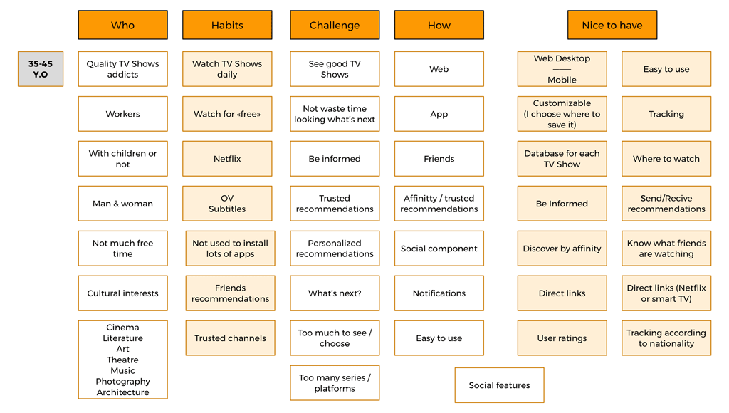
In order to clarify some of the collected data, I tried to categorize it in an Affinitty Diagram.
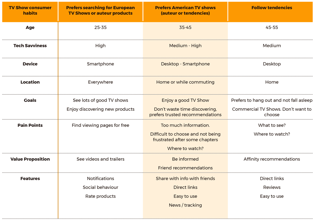
Then I’d created the user types to see the different groups of users. I’d found three types but I prefered to focus in one of them, because it was the main User Type taken from the survey
So, I’d decided to create two User Personas that synthetized the User I was trying to focus my app on.
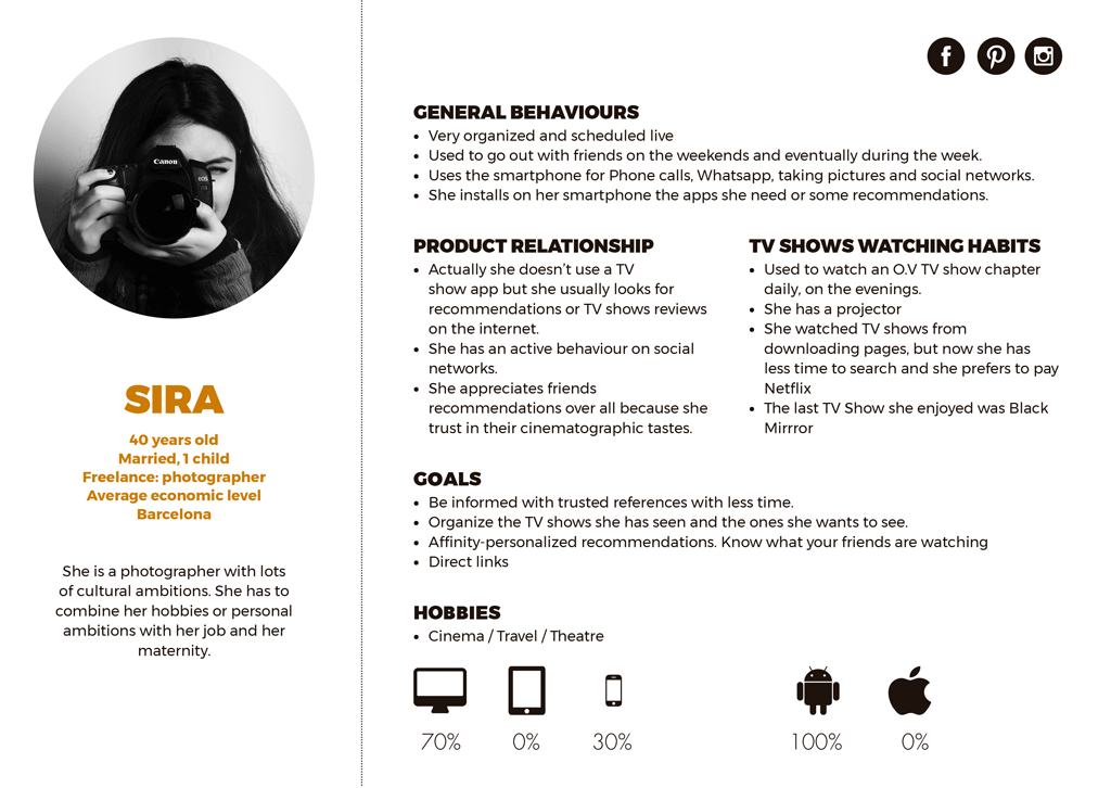
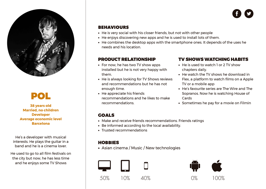
These two Users Personas helped me during all the process to focus the product and understand the users needs.
Finally I started thinking about how the Personas could use the app, and which screens could they see. I always tried to figure out the worst case scenario to force me to find the best possible solution
Information Architecture
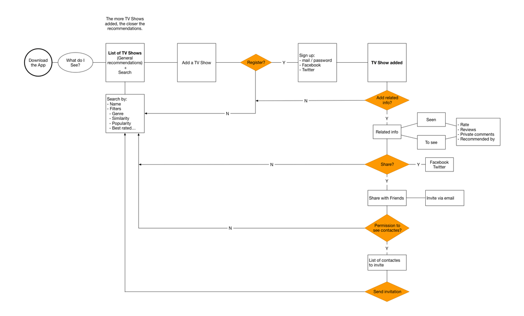
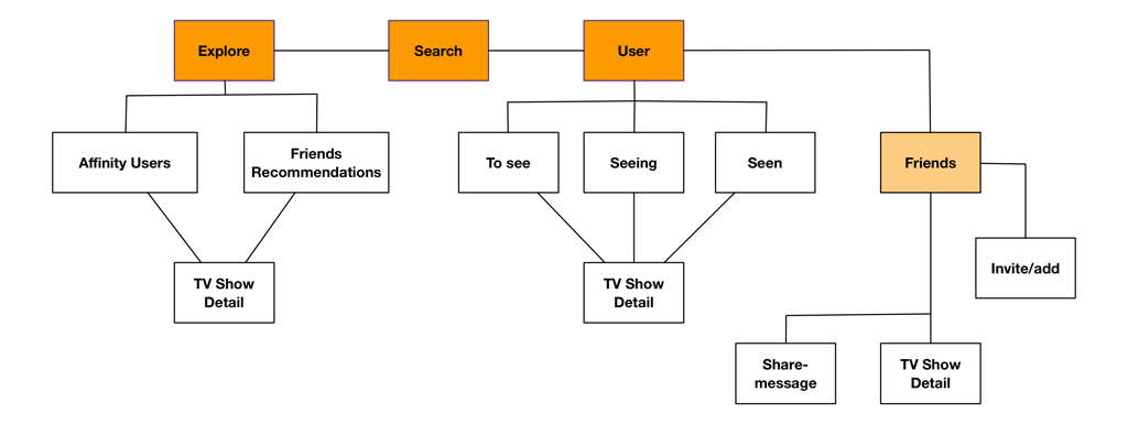
Next, was Information Architecture, where I’d started thinking about the Navigation, the User Flows, the Tasks and the Site Map.
This is the flow chart of the app from my User Persona point of view.
And this is the Site Map, where I had to think how to hierarchizy the content and the screens
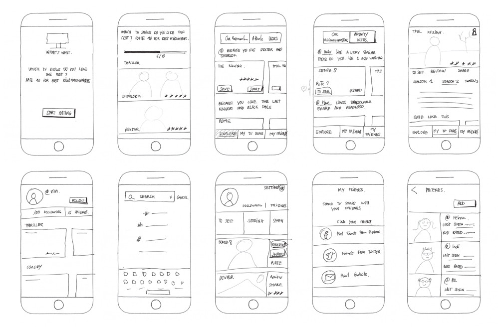
During all this phase I’d made lots of hand-made sketches. They where an important part of the design process and helped me to clarify ideas.
At this point. It was time to start thinking about the visual design.
Visual design
First, I’d started with some medium fidelity Wireframes to see how it could look in general terms. I just draw the main pages and I’d decided to leave the rest for the hi-fidelity mockups.
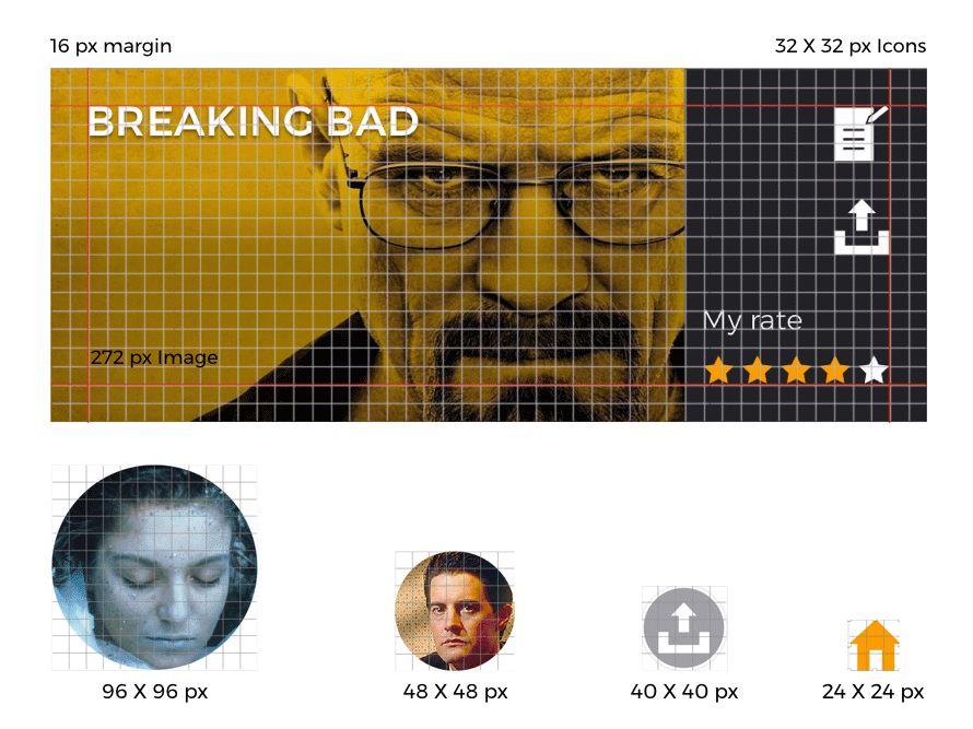
I starded thinking about the main colors and the font I would use

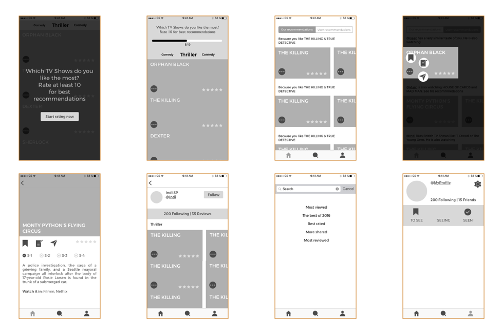
And then, I created a system grid of 8 pixels and the elements of the app where created following this module. I’d designed the patterns of the main pages following a established propotion, and then, I was ready to start with the High fidelity mockups…
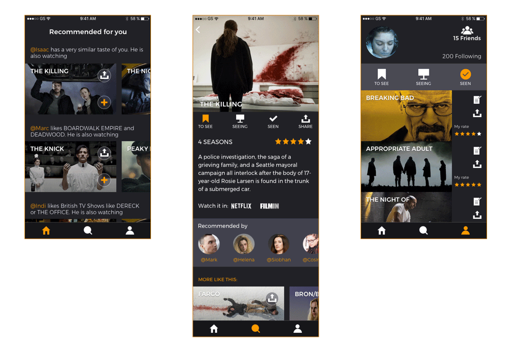
This is how they look
And this is the prototype that helps to to make a user test and correct some of details about the navigation.